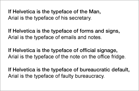
Yesterday, my friend Steve mentioned that the signage of Boston’s T, which originally used Helvetica, was slowly being replaced with Arial. It inspired this image.
Yesterday, my friend Steve mentioned that the signage of Boston’s T, which originally used Helvetica, was slowly being replaced with Arial. It inspired this image.

2 responses to “Typographical, Yet Analogical”
Make a splash at the office with this blast of irony and meta-meaning by hanging this printable copy, set in both Helvetica and Arial, up at work. All you need is a printer, a sheet of letter-size paper, a ruler and an X-acto knife.
It is sure to make your fellow employees think things about you!
LikeLike
Well done, Chris! It’s going on our FontShop fridge now (beside all the Arial).
You should send this to Mark Simonson and Gary Hustwit for their blogs.
LikeLike