Ikea, after decades, has changed its corporate typeface. Its Futura look-alike, Ikea Sans, has been replaced by Verdana. If you shop at Ikea, start watching them, because changes like this one are often an indication of lost direction.
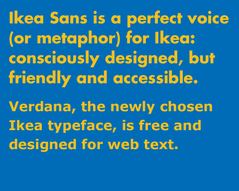
Typefaces should be the voice, along with the writing, that advertising and communications speak with. Ikea’s communications have, as long as I know of, been speaking with the voice of Ikea Sans; a functional, geometric sans serif typeface whose obviously designed nature is balanced by its friendly, uncomplicated forms. It’s a perfect voice (or metaphor) for Ikea: consciously designed, but friendly and accessible.
Verdana, the newly chosen Ikea typeface, is free and designed for web text.* Even if that name doesn’t ring a bell, you probably see it nearly every single day. Why did Ikea choose it? This is their reason:
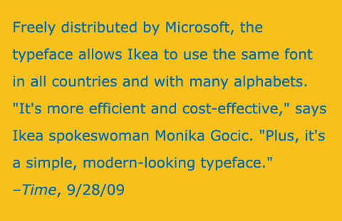
Godic gives a reason that just doesn’t make sense, unless you believe that the best corporate identity is the cheapest one. First off, “Simple, modern-looking typeface” can be said about the majority of san serif typefaces, without any point of reference. Secondly, Ikea Sans is an Ikea-owned typeface. They can use it anywhere they want and expand on it at their whim. Unless their licensing agreement was poorly constructed (which I doubt), this decision represents something more than an bad type choice. It’s a misunderstanding of one’s own brand. They’re throwing out a core component of their identity, which helps to define their voice, based on what sounds like a pointless financial argument. That usually hints at a business-driven panic that’s causing executives and middle managers to squeeze the budget lines they don’t understand.**
The trouble is that these decisions are made without concern for what the consumers and loyal customers actually want. And when a company like Ikea starts to tinker with its brand without proper planning, you’re getting a whiff of something much worse: tinkering with the business without thinking. If they think their brand perception, as formed by their identity, doesn’t have value, they should take another look at Tropicana.
If you shop at Ikea or like Ikea, I’d be willing to bet that this isn’t the first decision they’ll make without you in mind. And that’s why you should care that Ikea has adopted Verdana.
*It was designed for and released by Microsoft, for free, as part of the “core fonts” package with Windows. Software companies release fonts for free for one reason: to make their software work and look its best in use. The core fonts were released for Microsoft’s most important web product: Internet Explorer. As such, Verdana was designed for the unique demands of text-sized type on a low-res computer displays. In fact, while it can be printed, it was not designed to perform best in print.
**Let’s ignore the fact that now they have to pay to re-typeset and produce virtually every sign and printed piece of material they have.

Leave a reply to Michael J. Young Cancel reply