-
Only Waiting for This Moment to Arise
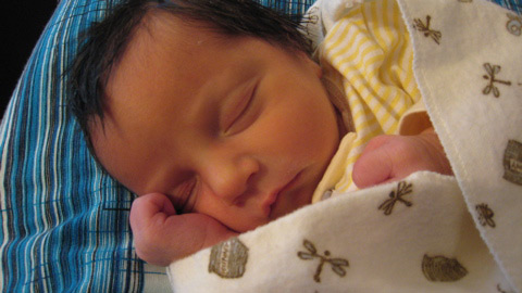
One week ago, on Thursday, January 31, at 1:40 PM, Alisa and I finally got to meet our little girl. She was a stubborn little bugger and wouldn’t flip her butt around for anyone, so Alisa went into the O.R. and our daughter was delivered by C-section. She came out at 6lb 5oz, with a full head of dark hair, and a healthy cry from her little 19″ body. In spite of the delivery method, we are all very, very happy and healthy.
The rest of this post contains quite a few photos, so if you’re on a low-bandwidth connection, beware.
-
Design Observer on Wilhelm Deffke
Design Observer, a consistently strong design blog/journal/website, has a great piece on Wilhelm Deffke by Stephen Heller. To claim my awareness of Deffke was anything more than vague would be stretch, but most people do have an awareness of his work. After all, we are all living in a world influenced by the work of Deffke and his contemporaries in Germany.

Deffke’s most enduring work, for me, is the Zwilling J. A. Henckels AG mark on the left. If you imagine it etched into the blade of a knife, you may remember it, as that’s Zwilling’s best-known product.Unfortunately, his work at simplifying and modernizing many older symbols, such as the Hakenkreuz, has tangled his name up with the Nazis. They took his geometric simplification of the Hakenkreuz, done decades before their existence, flipped it, and now most of the world recognizes it as the National Socialist’s swastika. Just to be clear, Deffke was not an ideological Nazi and did not design it for their use. (I suggest you read the article for the details and judge for yourself.) In fact, they took it without asking, which is kind of their thing, historically speaking.
Regardless, the article is a fascinating look at the ideological origins of the modern logo. It’s a good reminder of the power of ancient icons and marks, a legacy which our modern marks attempt to tap into. To look at dreck like the new Xerox bubble is to see how thin the soup can get, the further you stretch the stock. To look back to the beginnings is to catch the scent of a fuller meal in the kitchen of a true chef. Examining Deffke’s work on these symbols reminds us that some forms have roots deep into our primal consciousness, and that there are lessons we can learn away from the computer, with our eyes on our origins.
-
Imagine a Blueberry Geyser
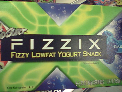
Seriously? Seriously.
The thought of this vile, effervescent goo in a child’s stomach is enough to turn my own.
-
Cloverfield
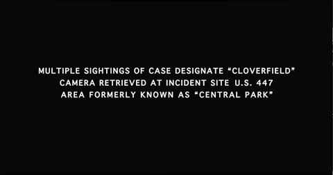
A few friends of mine and I saw Cloverfield on Saturday and I was very pleased with the film. It delivered exactly what it needed to and told a convincing and engaging tale from a unique perspective. For those not familiar, Cloverfield is the creation of J.J. Abrams, the creator of Lost. It tells the story of a group of friends whose going-away party is interrupted by the violent invasion of New York City by a massive creature. However, the story is presented as the unedited contents of a video camera SD card (the reason why the movie itself is one and a half hours), recovered after the events it recorded. The novel storytelling device is what prevents Cloverfield from becoming blockbuster dreck like Godzilla and, for me, added a terrifying realism to the entire film, which grabbed me from the moment the attack begins all the way through to the end.*
Note: I give no specific spoilers, but I do occasionally describe the movie’s structure, more often pointing out what is not done. I leave it to you to decide how ‘virginal’ you want you perspective to be going into this film.
-
I Am King of…This Room!
I’ve been listening to NPR coverage of the presidential races all morning (unfortunately) and seeing blurbs online. I’d like to send a message to those of you covering the primaries and caucuses:
Winning one state is not a crushing blow to the opposition and winning one state after losing one out of a total of two is not a comeback. You idiots.
Now please start covering something other than your airheaded opinions about other people’s opinions about 1/25th of something.
Thank you.
-
2007/2008 New Year’s Voteprime Celebration
Welcome, everyone, to the new year. I hope you’re all finding it to be the cornucopia of possibilities that I do. This year the Voteprime crew found itself once again in Philadelphia. Last year Alisa and I bought a house and so did Alisa’s sister and her husband (our good friend) Brian. Our houses are within about four blocks of each other, so Philly was the obvious choice.
Much fun was had, as you can see in Adam’s photos. Many firsts occurred that year (all photos taken by Adam):
-
I’m Not Dead!
In spite of Current Config going blank, I am still here. Expect some holiday bloggery when I have a bit more free time.
In the meantime, go visit Indexed, a great little web… comic… blog… infographic…. just go look, it is fantastic and Jessica Hagy deserves our attention and support.
-
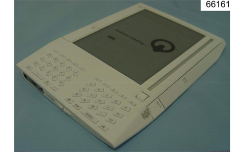
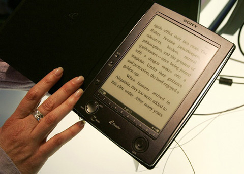
Digital Readers: Charging Into the Future, Ass First
As reported by Engadget, it appears that the Sony e-reader and Amazon’s Kindle are both essentially the same product.
The Kindle, if the FCC photo is to be believed, is ugly as hell. It looks like something out of NASA in the 1980s.
The Sony reader is a bit better, but as you can see in this photo by Rick Wilking from Reuters, it still comes off as a super-sized Palm Pilot. Has no one been paying attention to Apple’s success?
-
Jessica Helfand on Type and Context
Over at Design Observer, founding contributor and designer of some note, Jessica Helfand has written a succinct piece on some of the factors at play when a designer chooses type.
“About a year ago, I participated in a student portfolio review involving nearly a dozen American schools, many (most?) exhibiting the classic projects that characterize all undergraduate design programs – the color studies, the poster problems, the typographic exercises – all of which teach the student about that most essential design conceit: letterforms, and how to use them.
And here, I quickly discovered that something had gone horribly wrong. One after another, bright-faced young hopefuls displayed the products of their long hours in the studio. Book after book spilled forth with content ranging from how to cook a frittata to how to understand Freud. There were personal books, commercial books, literary and poetic books, serious and silly books, childrens books, how-to books, and everything in between.
And there they were – virtually all of them – typeset in Futura.”
I recommend it for designers and non-designers alike. It’s well worth the few minutes it takes to read it. As someone who went to school for design, I sympathize with her perspective and agree with her sentiments.
For those unfamiliar, this is Futura.
-
Interrogators of the Nazis Decry the U.S. Defense of Torture
By way of my friend Steve, a Washington Post story that says it just about as clearly and forcefully as anything:
“We got more information out of a German general with a game of chess or Ping-Pong than they do today, with their torture,” said Henry Kolm, 90, an MIT physicist who had been assigned to play chess in Germany with Hitler’s deputy, Rudolf Hess.
-
Subscribe
Subscribed
Already have a WordPress.com account? Log in now.
