-
Requiem Siting – The Exorcism of Emily Rose
My experience, generally, with movie-related type is that it’s either fascinating and great, or a marketing-driven non-decision. So, it’s always nice to see a great face used for movies. In this case, Hoefler & Frere-Jones’ Requiem is the typeface and The Exorcism of Emily Rose is the film.

The expected choice here would’ve been Carol Twombly’s Trajan. So much so, in fact, that a short film about Trajan’s abuse by the movie industry was made.* Fortunately, the designer(s) responsible gave the project an extra depth with a gorgeous typeface inspired by a 16th century Italian serif design. Requiem has all of Trajan’s stature without the imperious Roman character. Requiem’s design has thinner, slightly more ornate feel that gives the characters a biblical religious tone with just a tinge of malevolence that harmonizes perfectly with the ancient evil in the film. It’s a bit like old, dark, wrought iron: beautiful, unless you’ve got a reason to think otherwise, then it’s a little creepy.
Unfortunately, whoever’s responsible for the web marketing lacks the subtlety or the funds to pick up on this good decision. Guess what they use instead?
How’d you know?
*I’ve got nothing against Trajan, per se, but it’s a lot like Mrs. Eaves: a great design with such a degree of obvious character that it’s a very safe choice, even if it isn’t the most appropriate or interesting solution. In a way, it’s the perfect choice for film marketeers: say a whole lot while saying nothing at all.
-
FontShop’s Font 004
I’ve just now caught up with most of my life after getting back from TypeCon (Except for writing about TypeCon. Sad, I know.), and I got a chance to actually sit and absorb FontShop‘s fourth issue of font magazine. Honestly, it’s my favorite thus far, though that’s not surprising since there are so many names I recognize and admire/appreciate associated with it. font 004 is friendly and accessible, which is not always the case with type-centric publications and the writing within. The content is interesting and engaging, fun but not overly fluffy or shallow, and there are some interesting design moments within.
-
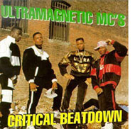
Ultramagnetic MCs’ Critical Beatdown
 Have you ever heard an album that makes a sigificant percentage of the music you listen to suddenly make more sense? It all suddenly become related and connected in a natural progression? I had that experience when I started to listen to KRS-ONE. I always knew that Ultramagnetic MCs was a key group in hip-hop. I’ve always liked Dr. Octagon (Kool Keith and Dan the Automator), and Kool Keith’s flow is still unmatched in funk, kink, style, and vocab. But now that I finally got my hands on ’Critical Beatdown‘, so much hip-hop makes so much more sense. Another building block falls into place.
Also, it’s really damn good.
-
F.E.A.R. Single-Player Demo

I woke up this morning to a freshly downloaded copy of the installer for F.E.A.R. – First Encounter Assault Recon, after failed attempts to download it yesterday (It came out at 1 PM EST, so I wasn’t surprised). So, here are my first-time impressions from my first play through of the demo.
-
Mexico Is Not Like Philadelphia
Back in June, (yeah, I know, I’m really late with this post) Alisa and I shambled into our apartment after seven days in Paradise Village, an enourmous super-resort compound located in Nuevo Vallarta, Mexico, nearby Puerto Vallarta (warning: this website will make your eyes and brain confused) and I started to put together this post the following day. There was so much stuff packed into that week, I’ll have to summarize with some quick snippets, rather than a full-on description:
-
Here It Comes
Via Bruce Schneier’s blog, the Washington Post reports on “the International Association of Chiefs of Police, which represents the heads of police departments in the United States and across the world, has issued new guidelines saying that officers who confront a suicide bomber should shoot the suspect in the head.” But this isn’t the scary part, considering that not shooting at the bomb seems fairly obvious. This is the scary part:
The police organization’s behavioral profile says such a person might exhibit “multiple anomalies,” including wearing a heavy coat or jacket in warm weather or carrying a briefcase, duffle bag or backpack with protrusions or visible wires. The person might display nervousness, an unwillingness to make eye contact or excessive sweating. There might be chemical burns on the clothing or stains on the hands. The person might mumble prayers or be “pacing back and forth in front of a venue.”
The police group’s guidelines also say the threat to officers does not have to be “imminent,” as police training traditionally teaches. Officers do not have to wait until a suspected bomber makes a move, another traditional requirement for police to use deadly force. An officer just needs to have a “reasonable basis” to believe that the suspect can detonate a bomb, the guidelines say.
To be blunt: if you have a Middle Eastern appearance and luggage, or are an electrician, make sure that you’re never nervous in public, or the police may lawfully shoot you in the head. Y’know, to be safe. I sure hope this doesn’t get traction in the U.S. But it probably will. I’m less concerned about awareness of important warning signs than I am of a policy of ’preventative’ shooting to kill.
-
Aaaand PUSH!

Phew. After lots of doing (mostly by the web master, admittedly) my redesign of the Theatre Alliance of Greater Philadelphia’s new website is up. Overall, I’m happy with it. We’ll be refining and revising it in the coming months (or years), but the improvement over the last one is significant, and that helps everyone. Plus, the identity redesign is now fully implemented across all of the major communication channels and materials. It’s always a little scary and exciting to see your work living in the real world.
If you’re in Philly and want to find some theatre or a theatre job, check it out.
-
Santorum on Feminism: “I can’t remember the woman’s name. It’s terrible.”
A friend of mine pointed me to this interview of Senator Rick Santorum by George Stephonopoulos, which demonstrates why his railing against “village elders” (by which he means liberal media and intellectuals) is so much fear-mongering to make the right look like the underdog when they have majority control of the U.S. government.
Santorum falls into the trap of believing the ideology over viewing the reality. He’s part of the group, which the Bush camp is part of, that instead of trying to see what the world is like, wants to just change it all in their own way, regardless of the reality of the world (see the war in Iraq for further examples). The interview is largely Santorum speaking about his views we’re familiar with, and refusing to apologize for implying that liberalism in Boston made priests sexually abuse children (a statement that was easily refutable, even when he made it in 2002). However, he is stopped dead in his tracks when it comes to his views on feminism and the “radical feminists” who are responsible for a “war” and a “crusade” against women who don’t work. Stephanopoulos asks him one simple question: who are these feminists. Read on to watch Santorum demonstrate the idiocy of his own position:
-
Harry Potter and the Half-Blood Prince

Done. Man, that was fun.
Better than The Order of the Phoenix but just as lengthy. It’s darker, but it fits perfectly with the overall development of the plot and characters. And thank god Harry got over being an idiot, for the most part. I wanted to smack the little jerk in the last book. Another plus is that, for the most part, she avoided the long explaining-past-plot-points-again thing, which avoided a lot of the dragging points in the previous book.
One this book’s greatest strengths is how Rowling capitalizes on the tensions she’s been building since the beginning, which allowed her to follow the general formula of the series without driving you crazy. Even with all of the talk about the major plot points before I got my hands on the book, very few moments felt expected or obvious.
Well, it was totally obvious that Luke Skywalker is the Half-Blood Prince. But you didn’t need me to tell you that.
-
Going to TypeCon 2005
For seven years now, The Society of Typographic Aficionados (SOTA) has held an annual type conference in a different host city. This year, it’s in New York City and I’ll be there.
My very generous friend Paul is even letting me crash at his place so I can begin the type-geekery one night early. If I make it out of this without leaving my job for an internship drawing type, I’ll consider that ’not losing my head’ during the con.
To say the least, I am pumped.
-
Subscribe
Subscribed
Already have a WordPress.com account? Log in now.
