-
Mundanely Prescient

Is it odd that I feel cheated somehow, even though the fortune was free and it came true?
-
Texas: The Lone State…Star?
 I saw a Texas quarter recently (I’m holding right now, in fact, and you can see one to the left here.) and I’d like to thank the Texan government for providing such a durable lesson in typographic basics, in the form of a ’what not to do’.
Texas, as we know, is ’The Lone Star State’. So, it makes sense that the designer (State. Governor Rick Perry) would want to use this phrase in his quarter. Unfortunately, as is often the case, the type gets the short shrift and is jammed under Texas’s western prominence. In order to fit the type into this oddly shaped area, Perry deemed that the line should be broken twice, and nestled under the southern nub of the prominence. In accommodating the shape, the lines also required tight leading*, which could get extra-tight because there are no descenders** in the phrase ’The Lone Star State’ to accommodate. So far, not so bad.
-
Rove/Plame Roundup
 I admit, I’m gleeful that such a high-profile Republican sleaze-merchant* like Karl Rove (shown on the left) is running from the harsh gaze of the spotlight concerning his exposure of Valerie Plame, a formerly covert CIA operative. That being said, it’s not easy to get a handle on the whole debacle and subsequent public squirming by the White House. Which is why it’s great that Matthew Baldwin of Defective Yeti has written a nice, easy-to-read, mostly even-handed summary of the events that lead to the renewed hullaballoo.
*I don’t call him that because he’s Republican, but because he’s the wet-work, dirty politics player who keeps Bush looking clean to those who can’t connect the dots, but allows Bush’s campaigns to be conveniently timed with sudden slander campaigns and malicious rumor mills.
-
Endtroducing: Deluxe Edition
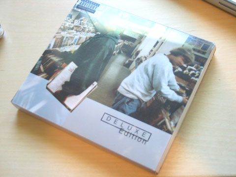
So, one of my favorite musicians, DJs, and hip-hop artists, DJ Shadow, re-released his first full-length album, Endtroducing as Endtroducing: Deluxe Edition, back in June and I promptly snapped it up on its release day. The re-release is a two-disc set, the first of which is the original album and the second is rarities, remixes, and alternate takes. There’s also a booklet included in the new packaging that contains: an excerpt from the Continuum book on the original Endtroducing, a hello from Shadow, and some brief notes on each new track. If you’re an avid Shadow fan, then it’s worth it. If you’re not, or you spend a lot of time on whatever file sharing service isn’t being closed down at the moment, then you may have heard most of it before, or won’t care enough to invest the cash for the new disc.
-
Concerned Is Hilarious
As some of you may know, I’m hopelessly addicted to Half-Life 2. Well, now I can feed my twin vices of HL2 and comics by reading Concerned: The Half-Life and Death of Gordon Frohman. It is hilarious and witty, with tons of subtle I-get-it-because-I-played-the-game humor. The prologue alone will give anyone who waited for the much-delayed release feel warm and gooey inside. But there’s usually enough generally-accessible comedy that non-gamers will probably get something from it. If you’ve played HL2 or are familiar with it, go read it now. If not, there’s a premise page to get you mostly up to speed. You may not get 100% of the references, but the comedic timing and construction is very well tuned and it still holds together overall, even if the humor of a few strips is lost on you.*
Thanks to Jon Sung for this one.
*This may be false.
-
Worst Point of Sale Display Ever
The creative brief for this display must’ve read something like this:
…should also target key market demographic of adorable demon children who’ve just lost two teeth biting into the skull of a stray dog. And want to be lemony fresh!
It’s so mind-rending that I couldn’t allow it to be on my front page. Click below to gaze into the abyss…
-
If I Stop Running, It’ll Just Take Longer
I ran the JPMorgan Chase Corporate Challenge this past Friday, which is a 3.5 mile run through the curvy roads of Central Park. I did 3.5 miles in 30 min 45 sec., just under 9 minutes per mile. I set a 10 minute per mile goal for myself, so I’m pretty happy about that. I only had to walk for about a minute or so at around 2.5 miles to regain my ability to control my limbs. I didn’t want to give up on running most of the way, because the thought of extending the duration of the race seemed worse than any price I might pay upon finishing.
I haven’t run any significant distance in about 9 months (I was jogging about a mile every few days at that time), and I got back from a trip to Mexico the preceding weekend (which I still need to post about). So the day after the race was over, my legs were about as useful as two columns of stiff cardboard. Then, on Saturday, they became more akin to a stiff piece of balsa wood, incapable of bending. By Sunday I could hide the fact that my legs were still a bit sore when I walked, and didn’t have to take stairs like an old man.
I figure by Wednesday I’ll be fully recovered and can start my mission of jogging regularly. Maybe next year I can run with the big kids from work (who bettered my time by about 5 minutes) and not have the mobility of a corpse in a snow drift when I’m done.
-
Dear Adobe, Pick Some Icons and Stick With Them
I use Adobe Creative Suite (CS) on my home machine, and Adobe CS 2 at work. CS is a suite of about 7 or so Adobe creative apps: Photoshop, Illustrator, InDesign, Acrobat, and GoLive, along with some other odds and ends. I made the transition from Photoshop 7 and Illustrator 10 at home about…maybe 9 months ago? I don’t remember. Anyway, the old icons, some of you may remember, looked like this:
 The early icons, particularly Illustrator’s, came from a long line of variations on a theme. Most designers have a mental a connection between Botticelli’s Venus and Illustrator. Their greatest advantage and weakness was their strong visual distinction.
Adobe then put MetaDesign to the task of redesigning their product line (I still like MetaDesign’s work and general philosophy, even if they aren’t the darlings of the design world anymore). They did a great job, in my opinion, and unified the product line, integrated their relatively new app (InDesign) and created a clean, elegant identity and packaging line. The resulting icons, of course, had virtually nothing to do with their predecessors.
-
Batman Begins: Comic Cinema Keeps Growing Up

I saw it this weekend, and Batman Begins is better than or equal to Burton’s excellent Batman. This is Batman and Bruce Wayne as they always should’ve been done. The depth of one of the most enduring comic characters comes out brilliantly in this rich, powerful, thematic film.
-
Cryptonomicon. And on. And on.
I’ve just started reading Neal Stephenson’s Cryptonomicon, which I picked up during my trip to Mexico after exhausting my other reading options with 6 hours of travel time still ahead of me. My selection was limited and my list of Books I Want to Read was not yielding anything useful. Cryptonomicon, on the other hand, has always been one of those Books You Should Read. Well, at least for me, having just enough interest in computers, mathematics, WWII, sci-fi, snarky world views, espionage, and other nerdy and semi-nerdy subjects. Besides the magnitude of the You Need to Read This-ness of this novel, the physical magnitude has always kept me away from it. The paperback edition is a bit shorter than, but otherwise nearly identical to, your average, run-of-the-mill, red brick. Oof.
I’m 91 pages into it at the moment, and if Stephenson can keep this up for the remaining 80-squinjillion, this book may make it to my top ten. It’s a book that’s essentially about its own audience and, as such, hits the target relentlessly. The effort required to navigate his prose is not inconsequential, but the reward far outweighs it.
I probably shouldn’t judge a book by roughly 8% of its total content, but considering that this amount of writing is around 35% of most novels, I don’t feel out of line displaying this much optimism.
-
Subscribe
Subscribed
Already have a WordPress.com account? Log in now.
